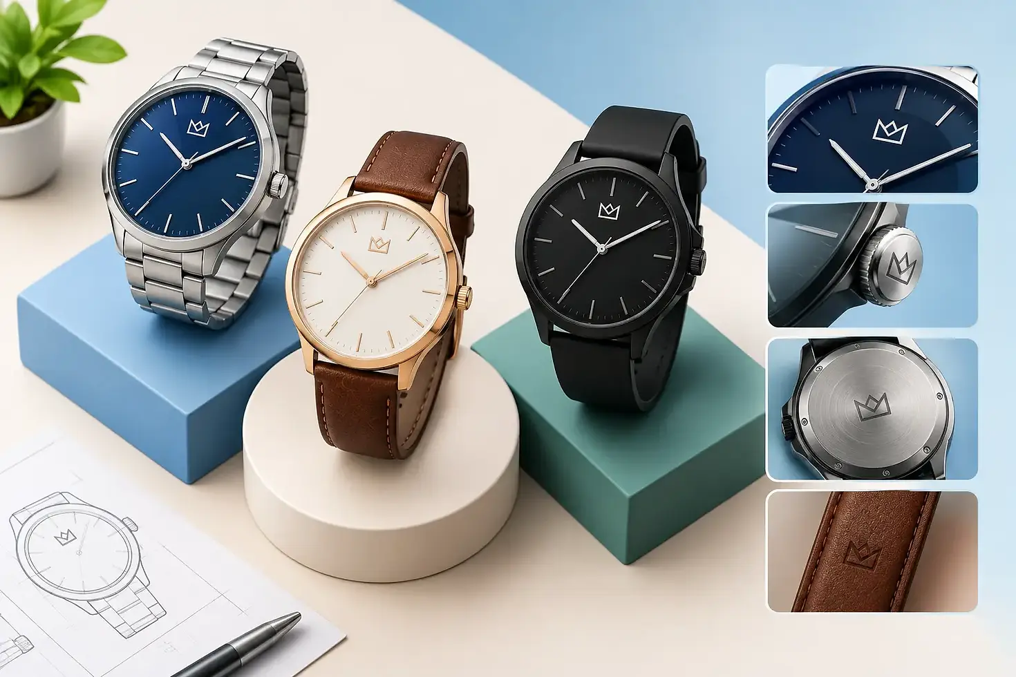
Logo Placement on Watches: What Works Best
A logo can occupy only a few millimeters on a watch dial, yet its position has a direct effect on how customers read the product. Logo placement on watches influences brand recognition, dial balance, legibility, perceived quality, and even the production method required. For private-label brands and established businesses alike, it should be decided during product development, not added as an afterthought before sampling.
A watch is a compact object with multiple visual elements competing for attention: indexes, hands, date windows, subdials, minute tracks, and decorative finishes. The right logo position makes the brand feel intentional. The wrong position can make an otherwise well-made watch look crowded, generic, or difficult to read.
Logo Placement on Watches Starts With the Dial Layout
For most branded watches, the primary logo sits below 12 o'clock. This is the established position because it is immediately visible when the wearer or customer looks at the dial. It also creates a natural visual hierarchy: brand name at the top, time display in the center, and supporting information near 6 o'clock.
This convention is reliable, but it is not automatic. A logo below 12 o'clock needs enough clear space around it to remain readable at the selected case size. On a 38 mm dress watch with slim applied indexes, a detailed logo may fit comfortably. On a 28 mm fashion watch or a chronograph with several subdials, the same artwork may need to be simplified, reduced, or moved.
The dial should be designed as one composition. It is not enough to place the logo where space appears available in a flat artwork file. The design team must consider the sweep of the hands, the height of applied markers, reflections from metallic surfaces, and the viewing angle created by a domed crystal.
The Standard 12 O'Clock Position
A centered logo below 12 o'clock is the most practical choice for many OEM and ODM programs. It supports fast recognition, works across dress, casual, sport, and promotional watch categories, and allows a collection to maintain a consistent brand signature.
This position is especially effective when the logo is a wordmark with a moderate character count. A short brand name can be printed cleanly on a smaller dial, while a longer wordmark may require a condensed type treatment or a separate symbol. When the logo contains a fine emblem, the manufacturer should review whether the smallest lines and gaps can reproduce clearly with the chosen process.
The 6 O'Clock Position
Positioning a logo or secondary mark above 6 o'clock can create a more minimal dial. It is often used when a prominent design feature occupies the upper dial, such as a large numeral, a moonphase display, or an open-heart window. It can also be suitable for a sub-brand, collection name, or country-of-origin statement.
The trade-off is visibility. A logo at 6 o'clock is less immediate than one at 12 o'clock and may be partially interrupted by the hour and minute hands during normal use. For a new brand seeking recognition, this is usually better as a secondary placement than the only placement.
Off-Center and Vertical Placements
Off-center logo placement can be appropriate for fashion-led concepts, asymmetrical cases, skeleton dials, or limited-edition designs. Vertical wordmarks along the side of a dial can also create a distinctive look. These choices require discipline. A layout that looks original in a digital rendering may become visually unstable once the hands, markers, and shadows of physical components are introduced.
For commercial collections, unconventional placement should have a clear design reason. It should not be used simply because a standard layout appears too familiar. Familiarity can be an advantage when customers need to identify a brand quickly at retail or in product photography.
Match the Placement to the Type of Watch
The best location depends on what the watch needs to communicate. A classic three-hand business watch benefits from restraint and symmetry. A larger logo under 12 o'clock, with limited supporting text, usually reinforces a premium and dependable impression.
Sport watches often have more functional dial information. Tachymeter scales, chronograph registers, date apertures, luminous markers, and high-contrast minute tracks leave less open space. In these cases, a compact symbol at 12 o'clock and a smaller wordmark at 6 o'clock may work better than forcing a full logo into one crowded area.
Fashion watches can allow greater freedom, particularly when the dial is intended as a brand statement rather than a technical instrument. Oversized logos, repeating monograms, or dial-wide graphics may suit the product category. However, the finish quality must support the concept. A large printed logo on a low-quality dial can reduce perceived value. Clean edges, accurate color matching, and durable printing are essential.
Promotional watches require another approach. The buyer may want a corporate logo that is instantly recognizable, often at a controlled budget. A simple printed logo at 12 o'clock is typically the most effective solution. If a customer requests full-color artwork, the available dial area, artwork resolution, and expected production quantity should be confirmed early.
Choose the Right Branding Method Before Finalizing Artwork
Placement and application method are closely connected. A logo that works well in one process may not reproduce properly in another. The manufacturer should evaluate the dial material, dial color, logo detail, target price point, and durability expectations before approving production artwork.
Pad printing is widely used for dial logos because it can reproduce fine text and multiple colors with good control. It is practical for clean, flat branding on many dial surfaces. The artwork must still be prepared correctly, particularly for very small lettering or close color separations.
Applied metal logos add dimension and can support a more premium presentation. They are commonly used on higher-value watches where the dial design has sufficient open space. An applied logo creates depth, but it also adds tooling, assembly considerations, and possible interference risks with the hands. The logo thickness and placement must be checked against hand clearance.
Laser engraving can provide a precise, permanent mark on metal components such as casebacks, clasps, crowns, and certain dial elements. It is suitable for fine line work, although contrast may be limited depending on the surface finish. Etched, embossed, and enamel-filled options may also be considered for special projects.
For each method, the production sample is the real decision point. Digital mockups are useful for confirming proportion and position, but they cannot fully show metallic reflection, print density, texture, or the visual effect of a sapphire or mineral crystal. A dependable manufacturing process includes reviewing physical samples before moving into mass production.
Do Not Treat the Caseback as an Afterthought
The dial is the primary branding area, but the caseback offers valuable space for deeper brand communication. It can carry the logo, model name, water-resistance rating, material information, serial number, and a short message. For private-label collections, this is often where a watch gains a more complete and proprietary identity.
Caseback logo placement should account for mandatory or market-specific markings where applicable. A crowded caseback can look less professional and become difficult to read after engraving. Prioritize the information that customers, distributors, and service teams need, then organize it with adequate spacing.
A centered logo is common, with technical specifications arranged around the perimeter. For exhibition casebacks, the logo may be printed on the crystal or integrated into the rotor, depending on the movement and design. These details can strengthen brand presence, but they require coordination across case, movement, and assembly specifications.
Extend Branding Beyond the Dial With Purpose
A complete branded watch may include logo placement on the crown, buckle, clasp, strap, hangtag, box, and warranty materials. Not every component needs a visible mark. Excessive branding can make a product feel promotional rather than refined.
The strongest approach is usually a hierarchy. The dial carries the main identity. The caseback provides product and technical detail. The crown or buckle can use a small symbol or monogram. Packaging reinforces the experience at the point of delivery. This creates consistency without repeating the same logo at every available surface.
Small components have practical limitations. A crown logo needs a simple mark that remains recognizable at a very small scale. A deeply detailed logo may fill in during engraving or become unclear after plating. Buckle branding also depends on the buckle shape, material, and chosen finishing process.
Approve Placement Through a Production-Focused Review
Before sample approval, review the logo at actual watch size, not only in enlarged artwork. Check whether the logo remains readable from normal viewing distance, whether it aligns accurately with the dial indexes, and whether the hands ever obscure key text. Confirm that metallic colors, white ink, and other special finishes have sufficient contrast against the dial.
It is also wise to review placement across the entire collection. If one model uses a printed wordmark, another uses an applied emblem, and a third uses a different position without a design rationale, the collection may lack a consistent identity. A defined logo-placement standard helps future models remain recognizable while allowing appropriate variation by watch type.
At Honour Time Corporation Ltd., logo artwork and component specifications can be reviewed as part of the OEM or ODM development process, helping buyers align design intent with practical manufacturing requirements. Clear artwork files, brand guidelines, and target positioning allow faster, more accurate sampling.
A well-placed logo does more than identify who made the watch. It gives the product order, confidence, and a recognizable face that customers can remember long after they first see it.


Comments